

When you are in the design studio, you will see two dotted lines that are seperate colours. A red one and a green one. These are two very important lines that you don't want to ignore!
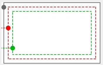
Here is a simple chart of the lines in the studio.
The red dotted line represents where the print will be cut.
The green dotted line represents the safe line. Anything that is inside the green dotted line is safe from being cut off.
Lets look at some examples.
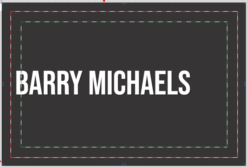
In this example we can see that the name has been put between the green and red lines. This is NOT recommended as the name is at risk of getting cut into during the finishing process.
Example 2
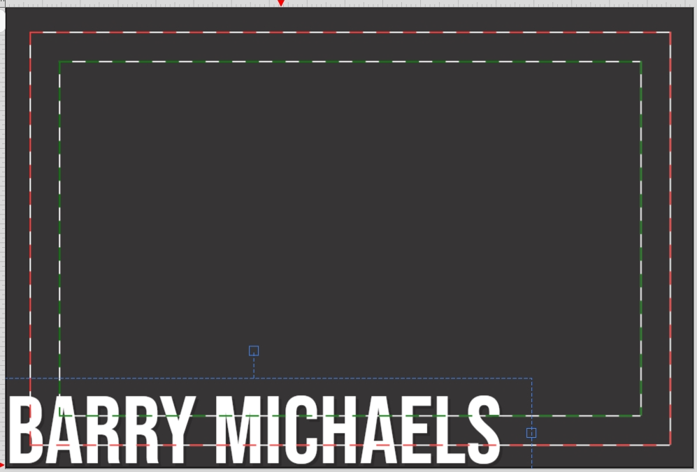
As you can see in this example, the text has been placed right on the edge of the canvas. this means the text has been placed well into the bleed area. This means that the majority of the name will get cut off unless moved. This is also NOT recommended.
Example 3:
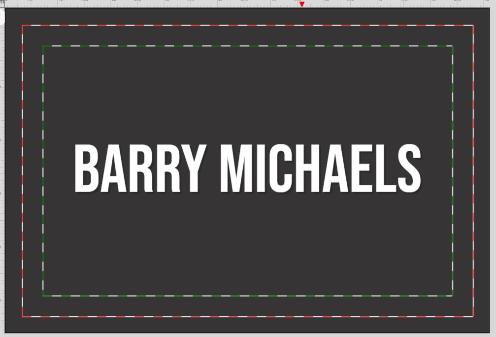
We can see in the third example, the text have been placed perfectly inside the green dotted line. This means that when cut all of the text will remain of the cards with nothing getting cut off. Perfecto!